I replaced technical QR types with choices merchants could use.
When card payment fees were too high for a business, Raiffeisen could offer QR payments instead. I redesigned the names, chooser, and cashier flow around how merchants accepted payments.
Snapshot
Scope and ownership
- Period
- 2023
- Team
- PM/PO, system analyst, developers, QA, and me as the sole product designer
- I owned
- Product design. I proposed the terminology, chooser, and cashier experience.
- We delivered
- Implementation and production launch as an agile team
- Not mine
- SBP C2B payment system, Central Bank rules, and engineering implementation
- Status
- Shipped to production
Why this mattered
Help merchants choose a lower-cost payment method without learning the Central Bank's technical terms.
SBP C2BRussia's bank-to-business QR payment system
Five participantsin the initial UX-test sample
Shippedrevised QR model and cashier functionality
The problem
The hard part was choosing
the right QR, not creating one.
The first design followed the Central Bank's categories: dynamic and static QR codes, shown as tabs with dynamic selected by default. In UX tests with five participants, people did not understand the two terms and repeatedly created a new dynamic QR instead of reusing an existing code.
Merchants did not need a lesson in payment infrastructure. They needed to choose a QR based on how they accepted payments. After the tests, I proposed changing both the names and the chooser.
- 01Choose a QR for the payment situation
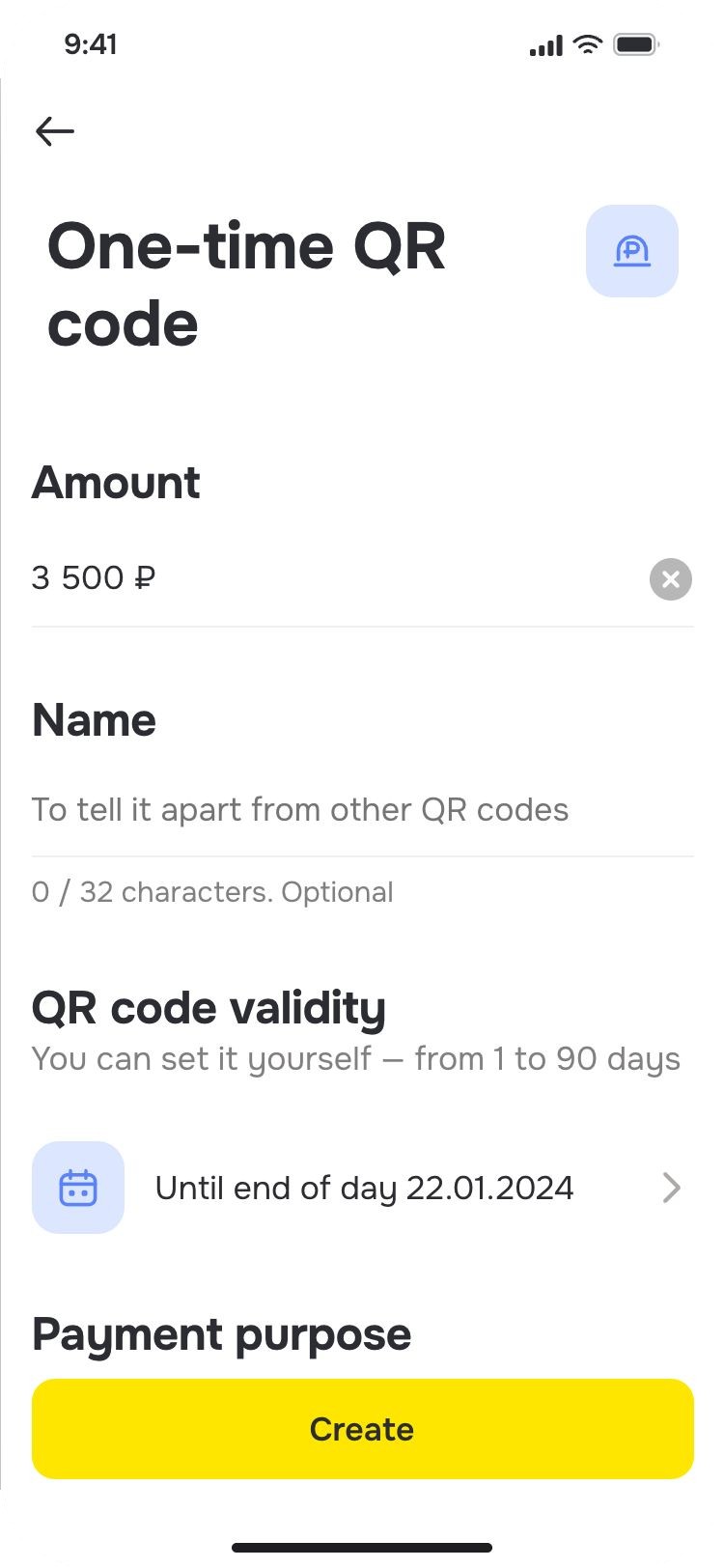
- 02Set or change the amount
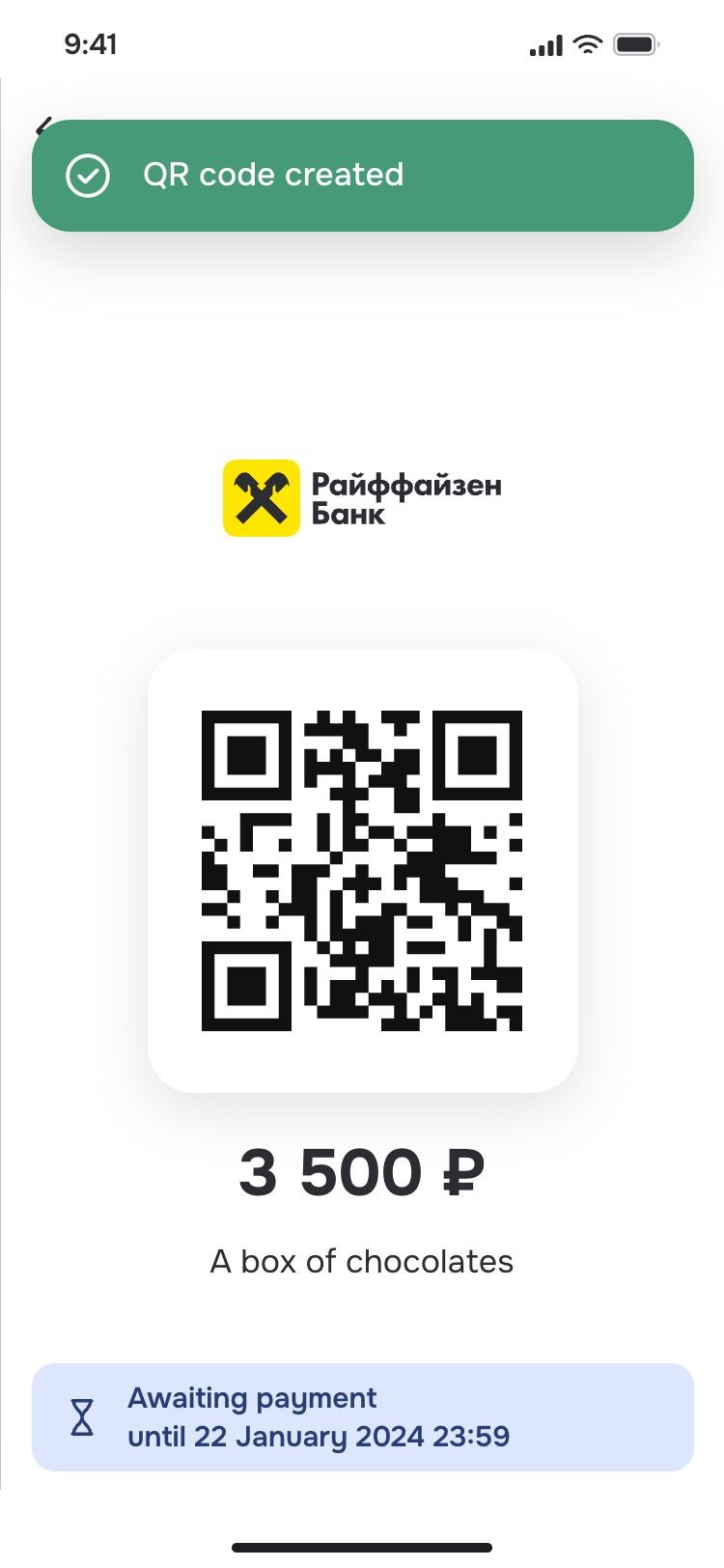
- 03Show the QR
- 04Confirm the payment
Rename the system around the merchant’s task
Decision 1 · Use task-based names
“Dynamic” and “static” described how the payment system worked. They did not tell a merchant whether a code could be used again.
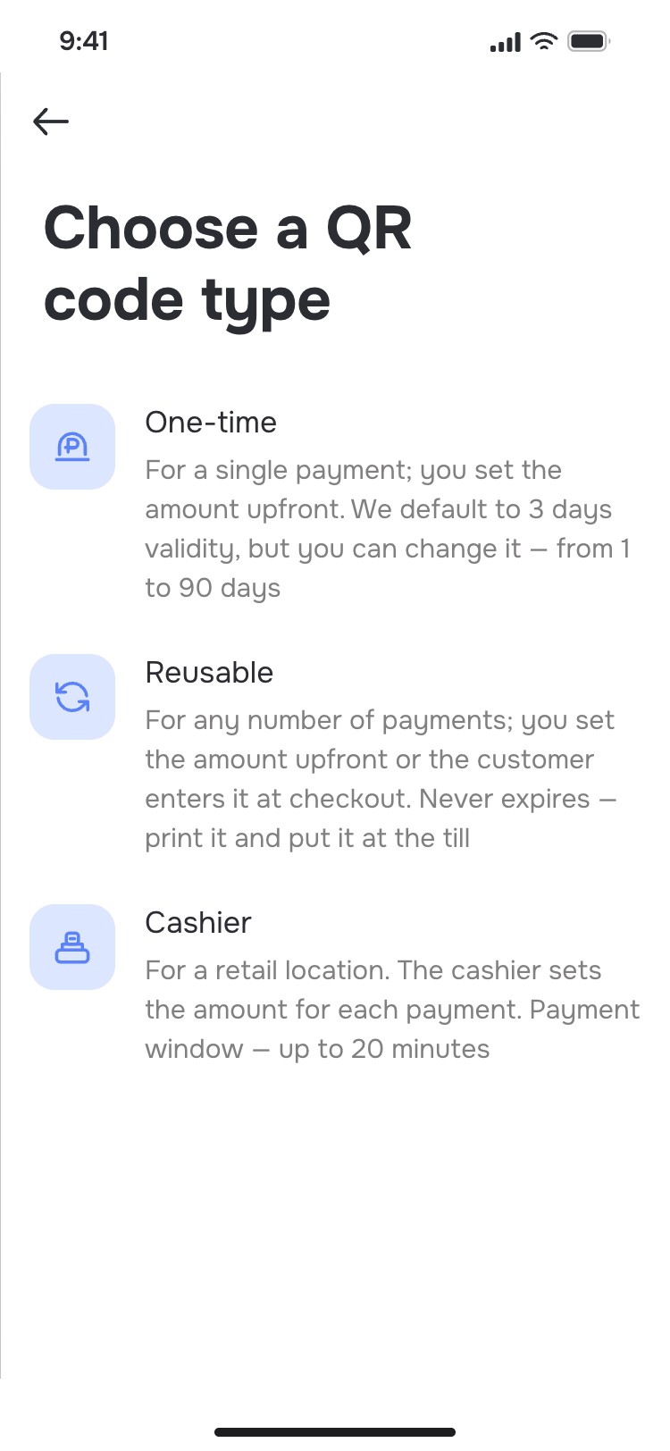
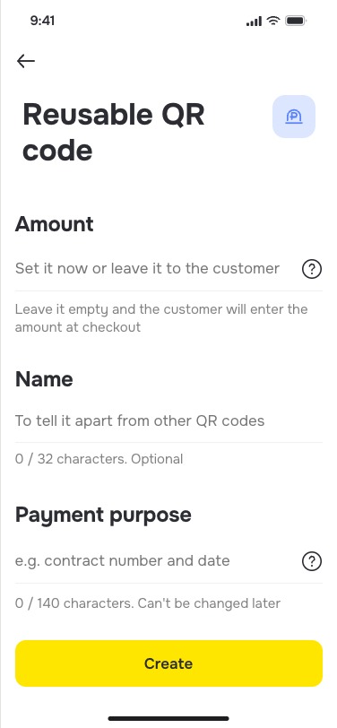
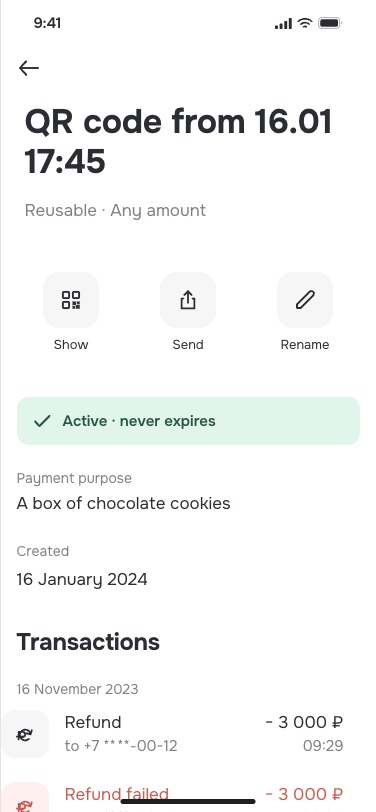
I proposed the customer-facing names one-time QR and reusable QR. “Reusable” connected the feature to a familiar situation: a fixed-price service, such as a manicure, could show the same code to each customer.
I considered two alternatives, then kept the underlying capability and translated it into task-based language rather than removing choice altogether.
Alternative 01Keep the Central Bank’s terms unchanged.
Alternative 02Offer one QR type, as one competitor did.
Trade-off: merchants still had to choose between several modes. The next decision made the criteria visible before they created a code.
 →
→ →
→
Replace a defaulted tab with an explained list
Decision 2 · Explain the choice first
The original interface selected dynamic QR before the merchant had expressed a need. Removing the default was one option, but the two categories would still be unexplained.
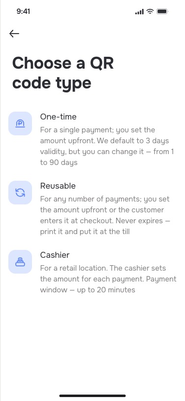
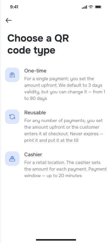
I proposed a list of three variants: one-time, reusable, and cashier. Each option described the payment situation it supported. Merchants could see the decision criteria before creating a code.
Trade-off: the list added a step. I proposed keeping it while merchants learned the model, then using usage data to decide whether to prioritise one mode or simplify the chooser.
The available evidence does not show whether the team later collected that data or whether selection accuracy improved.
Dynamic / Static
A technical default selected before the merchant expressed a need.
One-time / Reusable / Cashier
Each heading is followed by a plain-language description of the payment situation.
 →
→ →
→
Give cashiers payment tools, not the owner’s bank account
Decision 3 · Limit cashier access
A fixed-price reusable QR did not cover every point of sale. Cashiers needed to enter changing totals, but merchants did not want to give employees full access to internet banking.
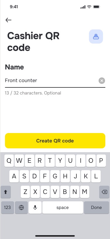
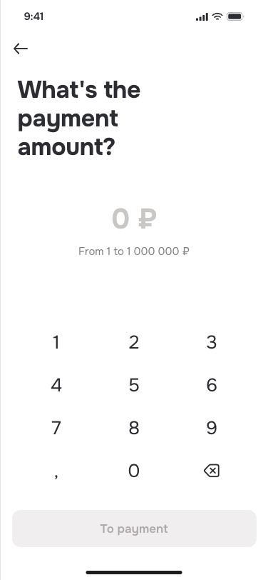
I proposed a cashier QR with a changeable amount, plus a limited experience around two tasks: create a QR and check whether the payment succeeded.
RejectedLet cashiers use the owner’s full banking access—avoids a separate surface, but exposes accounts, transfers, and settings cashiers did not need.
ChosenExpose QR creation and payment status only.
Trade-off: the limited cashier experience increased product and implementation scope. In return, access matched the cashier’s job.
The experience shipped with the wider QR work. I do not have preserved evidence of adoption or operational impact.
 →
→ →
→
Evidence
What changed, and what remains unmeasured
- Method
- UX tests with five participants
- Finding
- Participants did not understand “dynamic” and “static” and repeatedly created new dynamic QR codes
- Test-driven changes
- Task-based names and an explained chooser
- Related scope shipped
- A limited cashier mode for changing totals
- Product outcome
- The revised QR experience shipped to production
- Limits
- Post-change comprehension, selection accuracy, usage, payment success, savings, retention, and revenue were not preserved in the available evidence
Testing changed the product model. It did not establish a quantified user or business outcome.
Reflection
Technical accuracy does not guarantee user understanding.
The first design treated the Central Bank’s terms as if merchants already understood them. The tests showed that technically correct categories could still lead people to the wrong action.
The redesign kept the underlying payment options but described them through merchant tasks: use once, reuse at a fixed price, or let a cashier enter changing totals.
The unresolved question was how long the explicit chooser needed to remain. I proposed using behaviour data to decide when to prioritise a mode or simplify the step. The available evidence does not show whether that follow-up happened.
Appendix
QR transaction list and filters
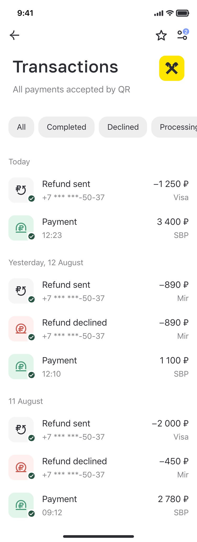
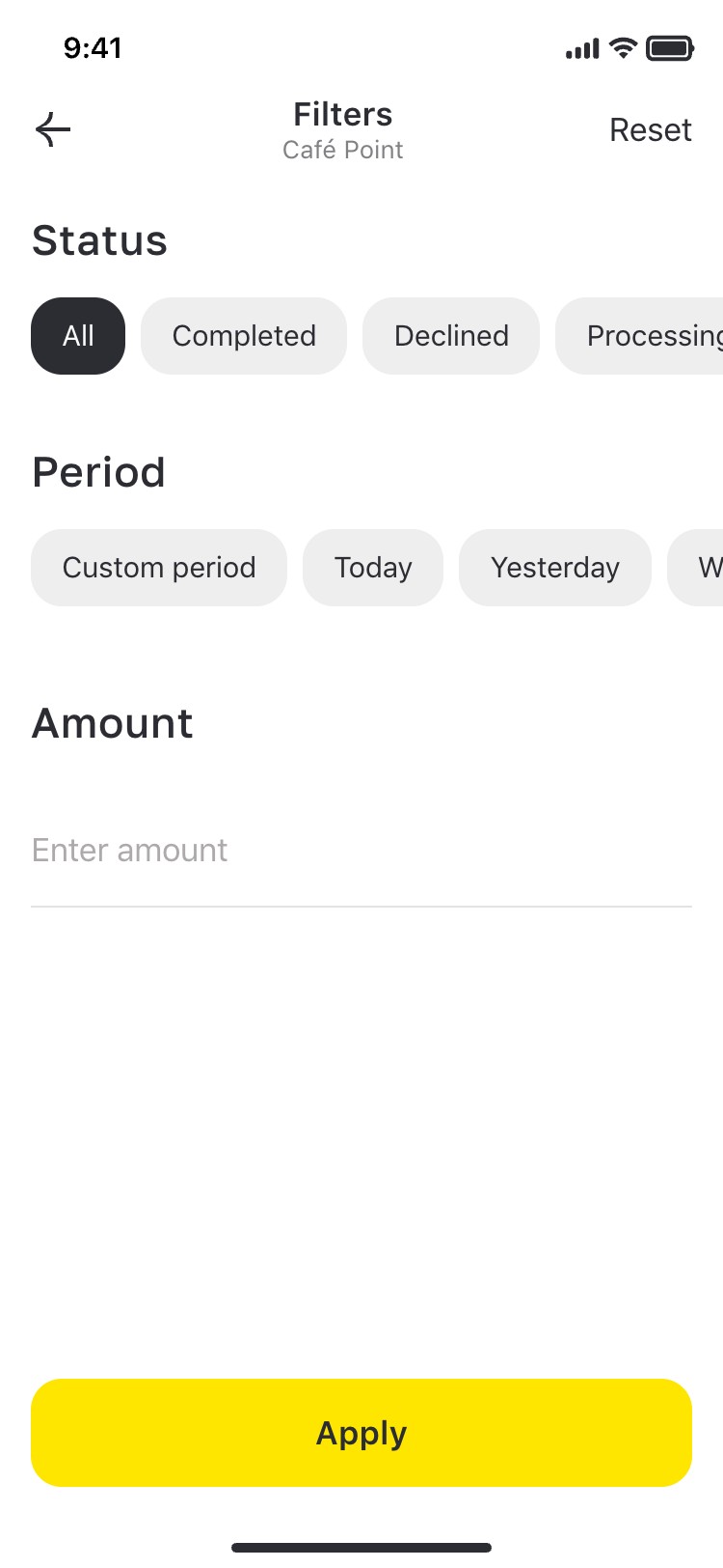
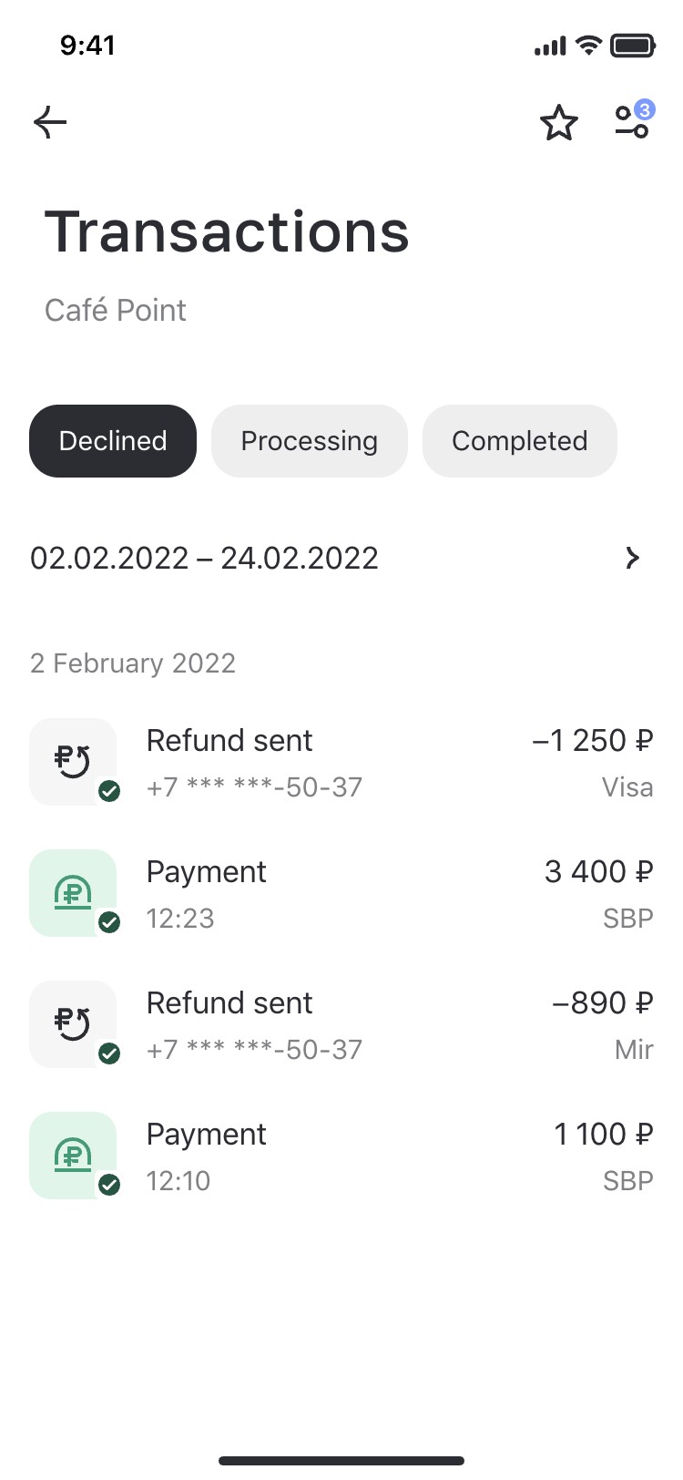
I also worked on the QR transaction list and filters, bringing payment status, period and amount filtering into the merchant’s operational flow, with transaction details and empty, loading and error states. This work is confirmed by the design source; its post-launch effect is not preserved in the available evidence.
 →
→ →
→
Next case study
 Semrush Locations Expansion